
▲ The visual communication and typographic design for 2012 Taiwan Yueqin and Folk Song Festival.
A piece of exciting news emerged from the Alliance Graphique Internationale’s (AGI) annual congress held at the Centre Pompidou in Paris at the end of 2017. Under the joint recommendation of domestic and international designers including Aaron Nieh, Ho Chia-hsing officially became an AGI member.
The portfolio that Ho submitted to the AGI gave a very clear context to his work. The introduction opened with his visual interpretations of foreign works, such as the book cover and typographic designs of the Russian literary classic, ‘The Collected Works of Pushkin’. These were followed by his visual communication works for local cultural activities in Taiwan, such as the promotional materials designed for Chen Ming-chang’s ‘Taiwan Yueqin and Folk Song Festival’, and commemorative posters for the ‘Tainan Folk Art Performing Troupe Exhibition’ held in Soulangh Cultural Park. To conclude his portfolio, Ho showcased his creative trajectory in calligraphy, seal engraving, and contemporary art. At first glance, although these works share neither a common form nor purpose, together they represent a designer who has been refining Taiwan’s local culture as a contemporary huaren design vocabulary.

▲ Ho’s book cover and layout design for The Collected Works of Pushkin (2016, Chi Ming Publishing).
The AGI maintains extremely rigorous criteria for membership; since its establishment in the 1950s, only some 500 world class designers have made the cut. Ho candidly admits, at first he wasn’t too confident in his odds, but realizing that chances like this one don’t come around too often, he decided to give it a try. “I wanted to see if my designs could make it, and if so then why? If not then why not?” The fact that Ho was selected by the AGI affirms the feasibility of his attempts to apply Eastern art forms to design, such as calligraphy and seal engraving. More so, it shows that his design vocabulary, which is distilled from Taiwan’s local culture, can be appreciated by people from other countries and cultures. This is intercultural communication.
After more than a decade of experimentation with art and design that was fraught with fumbles and stumbles, Ho gradually forged his own path. He developed a unique approach, which led to his own individual style. This path was forged from Ho’s personal background, experiences, and cultural development. In recent years, he has begun integrating his own experiences and ideas to propose the necessity and possibility of establishing a method. He hopes to spark even more imagination in Taiwanese design, “because I think you can develop your own design identity in Taiwan so long as you are familiar with the atmosphere.”
The Design Method of Chinese Seal Script
If there was ever a symbolic starting point on Ho’s journey in design, it would be the seal that he carved while studying at university. Ho majored in calligraphy, seal engraving, and contemporary art. At one point, he shut himself in his studio for seven days to engrave the 260-character Heart Sutra on a seal measuring just seven by seven centimeters. At first glance, this might seem like obsession or madness, but Ho says that it wasn’t until he looked back on this path many years later when he realized that his all his creative works, from writing to design, could be traced back to this seal.
Ho explains, “Calligraphy and seal engraving have always been at the core of my design.” He took a roundabout route to arrive at this point. Ho’s first choice of study at university was Western art, however, he did not achieve the grades required for this field, and ended up studying painting and calligraphy where he learned about Eastern calligraphy and seal engraving. Although this turn of events created enormous frustration, there was an unexpected light at the end of the tunnel. Ho’s initial resistance depleted and he began studying the subjects with care. He gradually developed an interest in calligraphy and seal engraving, and became enchanted by the spiritual connotation and forms of expression of these art forms.

▲ Ho’s seal script work created while studying at university.

▲ Ho’s 2012 exhibition, ‘Tshing-tshun Tsiām-tōo’. Calligraphy and seal engraving is not limited to paper; the space is also the carrier of his creation.
Ho has never been able to settle within the traditional framework. “The training we received at school was based on traditional calligraphy, and the understanding of calligraphy’s value was based solely on historical calligraphy classics. I like to study the classics, but when I write those characters I experience doubts and dissatisfaction and I ask myself, “What else can I write beside from this?” The restlessness that bubbles up in the heart of many a creator caused Ho to take a step outside of the traditional calligraphy framework and embark on a long-term character-writing experiment. He developed his own variant of Chinese seal script.
During his explorations in artistic creation, Ho encountered some incompatibilities in the existence of the traditional Chinese seal script framework. He tried reinventing it as contemporary art, but was confronted with challenges that he still finds difficult to put into words.
Life eventually directed Ho towards design, but the energy he accumulated from artistic creation meant he never lost sight of his goals. In 2002, he began working as an art designer at Eslite Bookstore, and in 2006 he opened his own studio Timonium Lake. Ho gradually realized that he could apply the principles of calligraphy and seal engraving to graphic design, such as calligraphy’s lines, the expression of qi, and seal engraving’s positive and negative spatial relationship. When combined with Western-style grid logic, different perceptions emerge for the arrangement of characters and layout. “Seal engraving is a form of design, so to speak,” says Ho. “And there is much Eastern-style logic that can be transplanted directly [into graphic design].”
From his many years of typography and design experimentation, Ho managed to develop a methodology from the various characteristics of mark making in calligraphy and the sense of space in seal engraving. In contrast with Western-style, realistic representations that rely on dot-lines and single-point perspectives, in his point of view the lines in Eastern art, and the sense of space constructed from the corresponding multi-point perspective, embody the philosophical reflections on spirituality. However, he also believes this is not to distinguish between East and West, nor does it emphasize one’s value over the other, which might descend into the stereotypical pattern of localism. Rather, Ho believes in excavating possibilities from traditional Eastern art forms, and flexibly interpreting the cultural character of East and West to create a contemporary huaren design vocabulary.
One example is a recent line experiment conducted by Ho. He used rulers and pencils to duplicate several parallel line segments of equal length on paper. The spaces between the lines showed a calligraphic, brush stroke-like sense of flowing movement. These lines, which combine Eastern and Western characteristics, can be used as building blocks for graphic design. In the book cover design of the second series of ‘L’Abécédaire de la littérature’, Ho applied this linear foundation and used different forms to visually interpret each the subject of each book, and the results exude both Eastern charm and Western rationality. His design for the book series echoes the intention of Taiwanese writers in response to Western ways of thinking.

▲ The line unit created by Ho.

▲ The book cover design of L’Abécédaire de la littérature (2018, Acropolis Publishing).
Ho continuously applies the transformation of Chinese seal script art into all types of design. For example, in 2017 he received the Taiwanese publishing industry’s highest honor, the Golden Butterfly Awards’ Golden Award for his work on ‘Le Moulin’. The design incorporates a layout inspired by the unique spatial sense of Chinese seal engraving, which creates a dramatic reading experience. Ho says, “All of my designs are accumulating these methods of experience.”
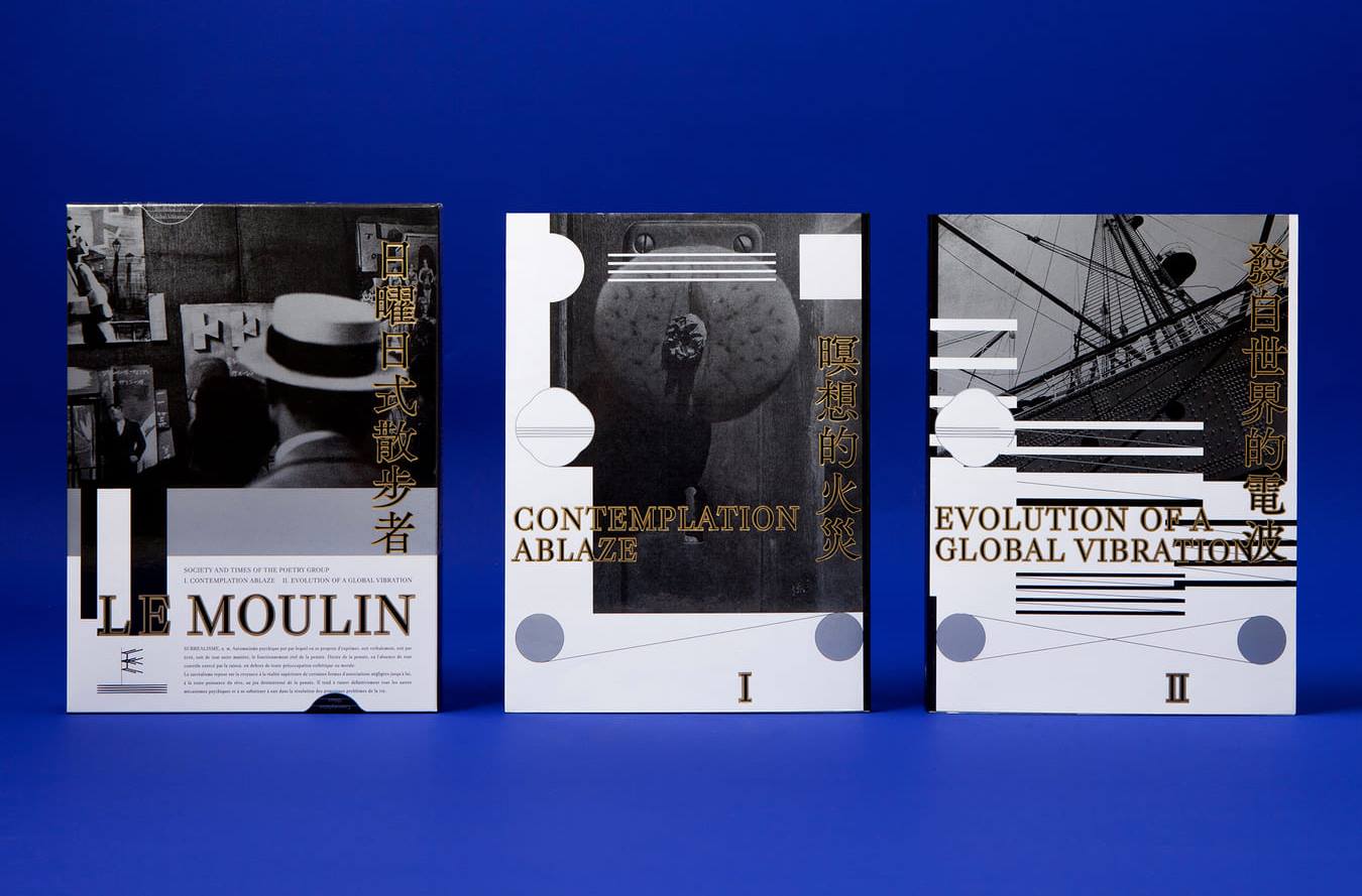

▲ The book cover and inner page design of Le Moulin (2016, Fisfisa Media).
“Creation Grows from the Land,” as does Design
Ho gradually carved out his own unique path by incorporating Chinese seal script art into design. At the same time, design work allowed Ho to develop from an artist who only focused on himself into someone with close ties to many other creatives. He mentions that is collaborating with many creatives from different fields, which exposes him to Taiwan’s abundant creative energy. Ho recalls a profound realization, “The artistic nature of creation is only one part of it. Being a designer means engaging in dialogue with the society in which you live, whether it’s political, cultural or about lifestyle. The closer the dialogue, the better the design.”
Ho’s experience in collaborating with Chen Ming-chang proved to be particularly inspirational. After producing the visual design plan for Chen’s concert ‘Hengchun Folk Song Temple Troupe’ in 2007, on more than one occasion, Ho designed the promotional materials for the ‘Taiwan Yueqin and Folk Song Festival’. To ensure the designs would effectively communicate the message, Ho shadowed Chen and other musicians as they toured Taiwan. He explored the roots of Yueqin music in Pingtung’s Hengchun, and exchanged thoughts with local veteran music troupes in Yunlin’s Tuku township. He treasures these unexpected experiences.
Ho recounts, “These experiences were like traveling abroad, even though I hadn’t left Taiwan. It was only through expanding the perception of the body that I was able to realize, Taiwan’s culture wasn’t what I had imagined it was; it’s something that cannot be defined by the stereotypical labels of “low class” or “local”. These cultures have a deep heritage, but they are relatively unknown and have not taken shape in the mainstream. However, you only have to live in this place to begin feeling these things.” He frankly acknowledges that until this point in his life, he listened mostly to international music. As such, he had never even considered that listening to indigenous music would provoke such an unprecedented reaction within himself. This kind of “culture shock” caused Ho to begin reconsidering the land in which he lives.
Chen Ming-chang’s music-making process had an equally profound influence on Ho. Chen spent many years conducting field work, learning and accumulating the various types of traditional music theory that still exist in Taiwan. He created works using the vocabulary of modern music, while incorporating indigenous, Nanguan, Beiguan, and Yueqin music. One example is the score he created for Japanese film director Hirokazu Kore-eda’s film ‘Maborosi’. The music is modern and avant-garde in sound, but is ultimately rooted in, and nurtured from indigenous music. Ho explains, “The inspiration behind this was so powerful. I was actually extremely astonished after learning about his methods. I hadn’t realized that Taiwan’s music was actually this developed.” He believes that Chen is helping to give new life to disappearing traditional art forms, and adds that the core concept behind Chen’s music creation process is that “creation grows from the land.”
Ho’s longtime collaboration with Chen led him to use Chen’s music creation methods as a reference, and then gradually develop his own design methods in turn. Ho also sampled Taiwan’s local folk culture, adding this to the calligraphy and seal engraving that he was already familiar with. For example, he transformed temple culture and beliefs into a contemporary huaren design vocabulary. He won the Golden Pin Design Award 2017 Best Design for his commemorative ceremony posters for the Tainan Folk Art Performing Troupe Exhibition. The posters feature life-like deities with flowing lines, accompanied by Chinese calligraphy arranged in the form of temple steles. The colors of gold, silver, and fluorescent hues are often seen in Asian temples and religious centers, and the resulting effect is extremely refreshing.

▲ Ho’s poster design for the commemorative inaugural ceremony of Tainan Folk Art Performing Troupe Exhibition.

▲ The visual communication and graphic design for the 2015 Taiwan Yueqin and Folk Song Festival.
Ho asserts, “I was only able to create this series after learning about Chen Ming-chang’s methods.” He believes that both creativity and design begin from life experiences, and that he needs to encounter these experiences himself. Ho narrates the process, “I live in this place, understand the way of life, and the accumulated wisdom here, and then go back to everyday life. I then use design to reconstruct that feeling, and I will naturally incorporate elements such as the lines or color palettes of temple architecture, or the arrangement of Chinese characters on steles. It’s not about duplicating what you see and turning it into a superficial imitation.” Ho’s tone lightens, but you can still hear the caution in his voice. “The more you do these kinds of things, the more you know what you have to respect or value. If you respect existing beliefs, culture, people, and the land itself, they will bless you with endless inspiration.”
Ho believes the works of many Western design masters were inspired by their own life experiences, and so they bring a spiritual sense into contemporary culture. He has also observed that though Taiwan’s indigenous spirit is strong, the indigenous design context is still undeveloped. Learning about Western-style design logic and values is necessary to some extent, but there is also a need for greater self-confidence to go out and develop Taiwan’s indigenous design vocabulary. In recent years, Ho has begun to realize his own experiences and methods. However, he emphasizes that the point of this is not to establish his path alone, but rather to inspire more people to join the exploration into this important issue by offering their vision and exchanging experiences.
“You can’t just use one interpretation to define a place’s design. It has to incorporate multiple lenses.” Ho believes the public has once again begun to discuss Taiwan-style aesthetics in recent years, and this is a positive phenomenon. However, he also emphasizes that Taiwan needs to develop its own context for design, and that it shouldn’t be defined by a particular manifestation or impression. Moreover, creative possibilities cannot be limited by certain cultural codes or symbols. Ho developed his own methods from his artistic experiments and design experiences, and hopes to invoke even more imagination in others to construct a diverse quality in Taiwanese design, or possibly even influence it on a fundamental level. Ho believes, “The more people take part, the more possibilities there are of achieving this.”

Ho Chia-hsing
Ho Chia-hsing is a graduate of the Department of Fine Arts at National Taiwan University of Arts. He double majored in calligraphy, seal engraving, and modern art. He is a member of the AGI. From 2000 until now, he has continuously published the experimental series “Writing Characters” on variants of Chinese seal script as a self-reflection on the evolution of his own personal writing throughout his life. In 2002, Ho joined Eslite Bookstore’s art team, where he was in charge of graphic design for the Dunnan branch, Dunnan Children’s Bookstore, and Shih Chien University branch stores. In 2006, he established his own studio Timonium Lake, and independently published “Wakayama Opera” and “Heart Sutra Twice” to launch his venture. His design works mainly reside in the areas of literature and art, including book design, posters, promotional materials, and exhibition planning. Ho plans to continue to explore the application of Eastern lines in his creative and design work.
In 2015, Tokyo University of the Arts published “T5 – The Frontline of Taiwan’s Book Design.” The book contains interviews with five book designers, and Ho was described as someone capable of representing Taiwan on the international stage. Ho is a two-time recipient of the Golden Butterfly Awards’ Golden Award for “Love in the 1980s” and “Le Moulin.” He designed the commemorative inaugural ceremony posters for the Tainan Folk Art Performing Troupe Exhibition held in Soulangh Cultural Park, for which he won the Golden Pin Design Award 2017 Best Design.
This article was originally published on Perspectives.